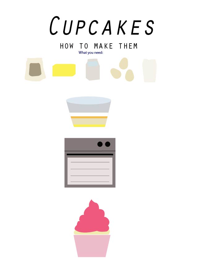
At this stage I am just drawing the basic shapes of my elements. Next weeks I will try to start composing them into an more solidified layout and create a basic skeleton for my infographic.
- Comment
- Reblog
-
Subscribe
Subscribed
Already have a WordPress.com account? Log in now.

Wow your icons are really coming along well! Next thing I would focus on would be creating a title which matches your theme. Maybe try using a font that is bubble like and you could potentially make it customised by having icing dripping off the top of the letters, cherries or sprinkles on top. Could look cool 🙂
LikeLike
Hey! Your shapes are looking so awesome! The colour scheme is looking nice too, the cupcake stands out with the pink. Perhaps you could make the title pink as well to tie it all in? Good job! Looking forward to your final piece 🙂
LikeLike
What I like about these the most is the fact that they’re not symmetrical. I am not sure whether you were aiming at that, but that “cartoonish” style really adds to the warm topic you’ve selected. But the first row of icons definitely needs some more work, as I cannot quite tell which is which.
Still, looking forward to seeing your infographic!
LikeLike
Your shapes that you are creating are coming along well. I always think the style and design of an infographic is important so that the work just flows. I think together with the colour scheme of your vectors/shapes and the font you are using, the style of your work is progressing. I think you could maybe make the top row of shapes a tiny bit more detailed just to show exactly what the ingredients are but other than that this is look great!
LikeLike